
Ford Pro Mobile:
Vehicle Details
May 2024 - March 2025
ROLE
UX & UI
TEAM
Ford Motor Company
TOOLS
Figma, Miro
In the fast-paced world of fleet management, the timely maintenance of vehicles is crucial for ensuring that drivers can complete their jobs efficiently. Ford Pro Mobile is designed to support this mission by providing a seamless platform for drivers to report issues and for fleet managers to oversee vehicle health, assign drivers, locate vehicles, and even control them remotely.
Goal: To redesign the vehicle landing page to improve user experience, enhance navigability, and accommodate future feature releases.
Results: The redesigned app interface led to improved user satisfaction, increased app downloads, and enhanced app store ratings.

The Challenge
As the lead designer on this project, I was tasked with reimagining the vehicle landing page from the ground up. User interviews revealed that the existing design was lacking in information, difficult to navigate, and visually outdated. From a business perspective, the design also constrained developers, limiting their ability to introduce new features. My challenge was to present a wealth of advanced features without overwhelming users while modernizing the interface, recognized by its iconic blue ‘swoop’.
Additionally, in March 2024, I spearheaded Figma training sessions for the entire design team at Ford Motor Company, focusing on advanced features such as Figma variables, Dev Mode, and Autolayout, reaching over 50 team members across six sessions. I also introduced 'Snippets' - a Figma channel that I created where I would include quick videos demonstrating complex Figma techniques, as seen below.

Methodology/ Process
I employed the Double Diamond UX process to guide the project from discovery through delivery. This approach allowed us to thoroughly explore user pain points, define clear objectives, develop innovative solutions, and refine designs through rigorous testing.
Discover: Conducted user interviews and gathered feedback to understand pain points and user needs.
Define: Identified key objectives and constraints, such as enhancing information accessibility, understanding developer limitations etc.
Develop: Explored design solutions through wireframing and prototyping, incorporating user feedback and competitive analysis insights.
Deliver: Finalised and implemented the design, adhering to the Ford Pro Design System.

Site Map & Information Architecture
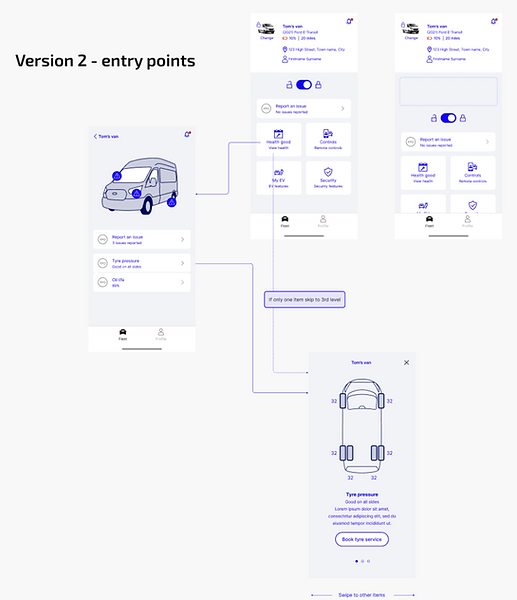
The first step involved overhauling the information architecture. Using Miro, I created a comprehensive spider map of the app, integrating all upcoming features from the design and development roadmap. Our goal was to triple the feature set, providing users with a detailed health breakdown, vehicle location mapping, and access to previous vehicle checklists. User feedback indicated that the existing vehicle image was too large, consuming valuable space and obscuring critical health information.

Competitor Analysis
To ensure our design was competitive, I analyzed apps from major players like BMW, Tesla, VW, and fleet management solutions such as Fleetio and Geotab. This research informed our approach to feature organization and user interface patterns.

Initial Wireframes
Armed with research insights, I created wireframes in Miro, presenting them to senior management to evaluate various layout options. User sessions revealed that health features were paramount, especially for fleet managers who also drove vehicles. It was crucial to design an interface that minimised friction between these roles.


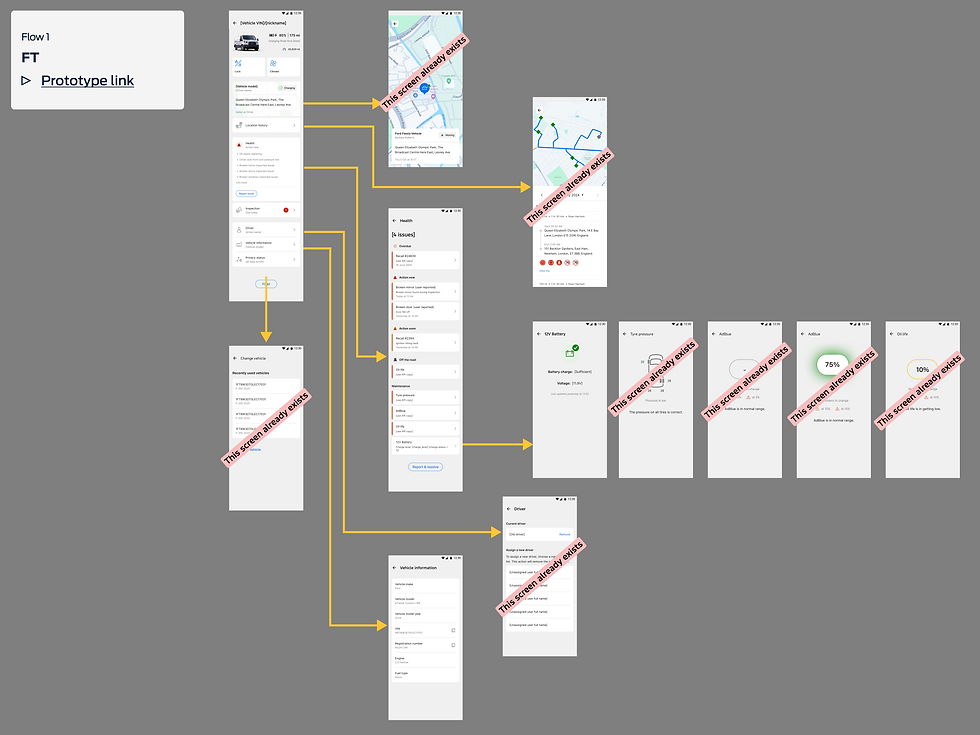
High-Fidelity Wireframes (Figma)
After selecting promising wireframe designs, I transitioned to Figma to create high-fidelity mockups. Over several months, I iterated 17 times, continuously refining the prototypes with user feedback. Some designs were set aside due to technical limitations, but the final screens provided a streamlined feature set with room for future expansion, notably remote control functionality. All designs adhered to the Ford Pro Design System, with custom components as necessary. Throughout this time, I ran quarterly 'Retros' with the deveopment team, understand what went well, what could be better and what needed to change to ensure the working relationship was as fruitful as possible. This ensured the team adhesion was as strong as possible and kept us in close contact.


User Feedback and Results
Success Metrics: Since the global release on iOS and Android, the app has doubled its downloads and improved its app store ratings significantly. The number of weekly active fleets increased by 11x. The number of paid Telematics subscribers using the mobile app each week increased from 9% to 19%. The number of weekly active electric vehicle users increased by over double, partly due to the expanded number of features available in the vehicle page designed here. The number of monthly active users increased by 331%.
User Feedback: Users expressed enthusiasm for the expanded health features and detailed vehicle information, which are crucial for frequent vehicle switches.
Reflections and Lessons Learned: The project underscored the importance of user-centered design and iterative testing. It also reinforced the value of aligning design goals with technical capabilities to ensure feasible and impactful solutions.
Next Steps: Future updates will focus on expanding remote control functionality and further enhancing user experience based on ongoing feedback. Two junior designers will work with the developer team, requesting my assistance when necessary.


“As a busy driver of a company fleet vehicle, having a well-maintained vehicle is critical to ensuring you can complete your jobs on time. Ford Pro Mobile is designed to help you do just that. By providing you with a quick and simple way to inform your manager of any issues, your vehicle can be maintained to the highest standards.”
— FORD MOTOR COMPANY, GLOBAL