
FordPass Pro 2.0
February 2020
ROLE
UX & UI
TEAM
Ford Motor Company
TOOLS
Adobe Illustrator, Adobe Photoshop, Sketch, Figma, Invision, Keynote, Zeplin, Abstract, Usertesting.com
FordPass Pro, the global app designed by Ford Motor Company for commercial users to remotely monitor and control their vehicles, is specifically tailored to meet the needs of small business owners who own between one and five vehicles. Following the initial release of FordPass Pro, the project has undergone a series of systematic improvements to enhance the user experience (UX) and user interface (UI). These enhancements have been driven by new user research and the need to accommodate a growing range of features and functionality.
For a comprehensive understanding of the design process, I recommend readers to start by exploring my work on FordPass Pro. This will provide a holistic view of the entire design journey, including the evolution of UX and UI elements.

Having been actively involved in the FordPass Pro project, I gained a deep understanding of the market's key competitors and utilised statistical evidence from analytics to identify the most frequently used features and aspects of FordPass Pro. Initially, the project started as a supplementary effort while supporting the design requirements of an app that was rapidly expanding in terms of features and functionality. However, upon presenting the user findings and initial prototype designs to the project's key stakeholders, it quickly transformed into the official FordPass Pro design revision.
During this process, it became evident that there were several usability flaws that needed to be addressed. With the advantage of new skills, design patterns, and fewer design restrictions, I collaborated with a talented UI designer to create the most intuitive and popular iteration of the app to date.
The Problem
As the lead UX designer for FordPass Pro, I took charge of designing the user experience and many aspects of Ford's first commercial-vehicle companion app. As the app's functionality and features continued to expand, certain areas of the app became overly complex, which negatively impacted overall usability. One particular issue was with the homepage, where displaying information related to multiple vehicles or a group of vehicles proved challenging.
Furthermore, my concerns were heightened by recent user research and app store reviews, indicating that security and productivity features were not adequately prominent. The influx of new features and functionality started to overshadow the simplicity and effectiveness of the task-focused user journey we had originally designed.
The Barriers
Amidst the global COVID-19 pandemic, I made a proactive decision to conduct all user testing remotely for the foreseeable future. As the agency designers were still refining new designs for the existing application, this project was led by a senior stakeholder at Ford and involved a senior UI designer and myself. To facilitate remote testing, I leveraged the platform usertesting.com, allowing us to set up monthly usability and concept tests throughout the pandemic, ensuring the project's continuity despite social distancing restrictions.
Typically, testing with 5 users is statistically sufficient to uncover around 80% of usability issues. However, in my pursuit of gathering additional insights into the concepts and the personal preferences of the target customers/clients, I conducted remote testing with 15 van drivers for each prototype concept. This approach included diverse participants from various backgrounds, age groups, and both genders.
Consistent with previous FordPass projects, the designs needed to be globally standardized. Therefore, user research was conducted worldwide to account for cultural norms, expectations, and nuances. In North America, a Ford Design System had been established to streamline the branding of the app, providing guidelines for sizing, fonts, and a baseline color scheme to work from.
The Process
Consistent with my previous projects, I employed the Double Diamond process as a framework to effectively prioritize the design work. Given the limited resources and being one of only two designers, with a sole focus on UX, I shouldered the responsibility for all UX aspects and a significant portion of the UI process. This posed time and resource constraints that needed careful management.
To kickstart the project, I built upon the initial research conducted for FordPass Pro, which revealed critical issues with the current app in its existing form. These issues revolved around scalability, difficulties faced by users with multiple vehicles, and usability concerns related to security and productivity. Therefore, the project's primary focus was on problem-solving through thoughtful design solutions. This involved an iterative process of sketching, conducting user tests, synthesizing data, and prototyping.
Personas
Building upon the extensive user research I had conducted during my involvement with FordPass Pro, I saw this as an opportune moment to update the personas that had served as the foundation for our app for the past couple of years. These personas were developed based on insights gathered from approximately 50 user interviews, capturing the most common and representative user needs and aspirations.

Prototyping
Instead of using Sketch, which we had employed in previous projects, we opted to explore a new platform called Figma for concept exploration. Figma stood out due to its superior collaborative working modes and online-based version control, enhancing team collaboration and efficiency.
During the initial stages, we utilized various tools for sketching. These included iPad sketching tools, hand sketches, and Balsamiq for more precise screen representations. Balsamiq's drag-and-drop components facilitated quick digital prototyping, making it an ideal choice for early-stage sketches (as seen below). I regularly shared these sketches with the wider product team, conducting weekly demonstrations to gather feedback from project managers and developers. Their insights helped determine the technical feasibility and what could be realistically achieved for the minimum viable product (MVP).

Remote User Testing
To assess the effectiveness of different navigation concepts, I devised an A/B Comparison Test that focused on two alternative navigation approaches: the typical bottom navigation bar (commonly found in iOS apps) and the more scalable side menu (also known as the hamburger menu, often used in Android handsets).
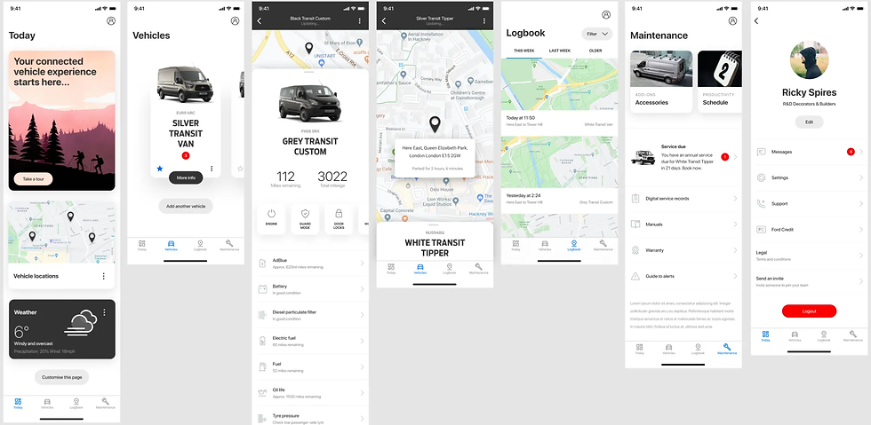
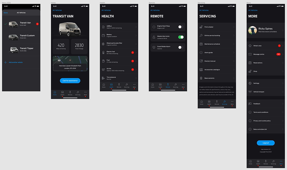
Both navigation options have their own advantages and limitations. The bottom navigation bar is typically used for apps with core functionalities and frequently visited sections that are distinct from one another. It provides instant access and visibility to different areas of the app. However, it faces challenges in terms of scalability, as it is limited to accommodating around five icons. In the current FordPass Pro app, a 'more' section was included as one of the tabs to address this limitation. However, this approach inevitably reduces visibility and usability. On the other hand, the side menu is more commonly associated with Android applications, although it has been gradually replaced by bottom navigation bars in many popular apps. Side menus offer greater scalability and can be more versatile for apps with similar or niche sections.
To tailor the experience to our target persona and incorporate relevant iconography, typography, color schemes, and sizing, I redesigned the screens in Figma, building upon our initial basic sketches in Balsamiq.


In addition to navigation concerns, there were several other issues with the current FordPass Pro app. One notable problem was the usage of the term 'Garage,' which metaphorically referred to a place for drivers and business owners to switch between vehicles. However, this term proved confusing to users, especially in Germany where it is not commonly used to represent a commercial vehicle depot. As a result, users encountered difficulties in viewing all their vehicles simultaneously and lacked a designated 'dashboard' where business owners could access a comprehensive overview of vehicle issues and business-related productivity features.
To address these issues, I conceptualised a map-focused design where a collective view of all vehicles could be intuitively accessed from the initial dashboard screen. The map view could be expanded or hidden entirely by swiping up or down on the collapsed-map module displayed. Once expanded, the map would show all vehicles in their respective geographical locations, along with relevant security and health-related information. However, to ensure the effectiveness of this concept, rigorous testing and scrutiny were necessary to verify user comprehension and assess the value of the displayed information.

In addition to the previously mentioned issues, the fixed-ratio screen size, which was initially prioritized by stakeholders, posed challenges when it came to smaller screen sizes. It limited the amount of content that could be presented cleanly at any given time. To address this limitation, I proposed implementing scrollable screens, which would allow for the display of more information in a user-friendly manner. Over time, it became evident that scrolling had become a widely adopted navigation pattern, not only in the initial FordPass Pro app design but across various websites and mobile applications. This navigation structure offers advantages in terms of user experience and is adaptable from desktop to mobile interfaces. To ensure users were aware of additional content below the visible screen, remote usability tests were conducted to confirm that users would scroll past the initial view. To provide a visual cue for content overflow, I recommended incorporating a cut-off card layout at the initial scroll position, signalling users to scroll for more information.
To explore new UX patterns and navigation styles for the redesigned concepts, I collaborated with the development team to assess their technical feasibility. With the release of iOS 13, we were able to incorporate several new native design patterns into the layout. One notable feature was the automatic switching between dark and light mode based on the time of day, which allowed us to reconsider the app's colour palette. Considering that the app would predominantly be used during daylight hours, I recommended prioritising a light theme initially, as it typically offers better reading contrast and readability. The dark mode would involve converting menus and top bars to a dark theme while maintaining a light background in the main views, ensuring consistent contrast and usability.

The introduction of a scrollable view opened up opportunities for further UX enhancements. Recognising that van drivers worked in diverse industries, I aimed to empower them with better customisation options for the home screen to cater to their specific requirements. By implementing a new modular home layout, users gained the ability to personalise their experience. Additionally, this layout provided the business with valuable insights into the most desired features and identified any that provided minimal benefit to users. This analysis was possible by tracking the frequency of user taps on different modules, allowing for data-driven decisions on feature prioritisation and optimisation.

Data Synthesis
The Define Phase involved studying the tests and making short video clips and notes that I could present back to key stakeholders and the wider product team in the form of short presentations. This enabled me to convey the results as effectively as possible, while suggesting potential paths and solutions moving forward.

During the Define Phase, I conducted a thorough analysis of the test results. To effectively communicate the findings, I created concise video clips and accompanying notes. These materials were then presented in short presentations to key stakeholders and the wider product team. This approach allowed me to convey the results in a clear and impactful manner, facilitating productive discussions and enabling me to propose potential paths and solutions for further progress.


To address the issue of users needing a separate "garage" to manage their vehicles, we made a significant change by allowing users to manage their vehicles directly on a dedicated screen. Additionally, we introduced a convenient feature where users could utilize their smartphone camera to automatically read their Vehicle Identification Number (VIN) when adding supplementary vehicles. This feature received positive feedback during testing and was confirmed to be included in the app's future version, with further stress testing planned.
The navigation solutions underwent A/B Comparison Testing, with both concepts scoring an average usability rating of 9/10 and a Net Promoter Score (NPS) of 70. While statistically favourable, users often overlooked the side menu and experienced difficulty in understanding their location within the app. In contrast, the bottom navigation bar addressed these issues and provided instant access to the most frequently used areas of the app. As a result, the bottom navigation bar was chosen to be implemented in the app going forward.
Although the map view received positive reviews, some users experienced confusion when first entering the app's dashboard view. To address this, we decided to move the dashboard view to the vehicle screens and remove it entirely from the home screen. This adjustment could easily accommodate the potential inclusion of the dashboard view in the future, based on research findings. To further alleviate the initial confusion, we made a design decision to incorporate a "Take a tour" module to be displayed upon first login, which will be tested during the next available opportunity. The ability for users to customise the dashboard proved to be unexpectedly valuable, with several alternative ideas and uses emerging from observing user tests.
The End Result
By utilising Figma, I facilitated collaboration and involvement from the development team and cross-departmental teams. Sharing an active prototype on Figma allowed for real-time editing and automatic updates, enabling seamless sharing of new ideas, concepts, and workflows throughout the entire design process. Furthermore, using Figma, I could easily share precise dimensions, color schemes, unique iconography, and graphics directly within the platform by sharing the file itself. You can access the active, live prototype through this link.
Although the new designs received positive feedback and were well-received during weekly meetings and presentations, the project managers (PMs) and product owner (PO) expressed concerns about the implementation timeline from a development perspective. To address this, I proposed an iterative approach referred to as "FPP 1.5." This approach involved making changes to colors, iconography, and components while maintaining the original app architecture and navigational pillars as a minimum viable product (MVP) step. This allowed the developers to upgrade the app incrementally, screen by screen, without disrupting the overall structure of the app. The integration of these changes would seamlessly fit with the rest of the app, ensuring cohesiveness. Subsequently, the information architecture could be upgraded at a later date, and all screens could easily be assembled together.
This iterative approach allowed us to tackle the major usability issues, including the garage functionality, colour scheme, and scrolling. By addressing these key areas in FPP 1.5, we could significantly improve the overall user experience. Additionally, from a project manager's standpoint, monitoring the updates and progress became more manageable. The utilisation of a component-based design system further facilitated efficient development and rapid advancement of the project.