
FordPass Pro — Designing a Global App for Small Fleets
November 2018
ROLE
UX & UI
TEAM
Ogilvy, GTB, VML, Ford Motor Company
TOOLS
Adobe Illustrator, Sketch, Invision, Keynote, Zeplin, Abstract
FordPass Pro is Ford Motor Company’s global companion app for commercial customers — built for small business owners managing 1–5 vehicles. It helps users keep their vans secure, monitor vehicle health, and stay productive day to day through remote monitoring and control.
I worked across the end-to-end design lifecycle on FordPass Pro, partnering with agencies including VML, Ogilvy, GTB (and others) as well as Ford product and engineering teams. My role spanned early discovery through to global launch and ongoing iteration.
Because this is a live product, I can’t share every detail publicly — but I can share the problems we solved, how we worked, and the outcomes.
My Role
-
Lead UX design across core journeys (with support from agency UI partners)
-
Discovery and research planning, including global user research
-
Personas, user flows, app mapping, and information architecture
-
Prototyping and usability testing (remote and in-person where possible)
-
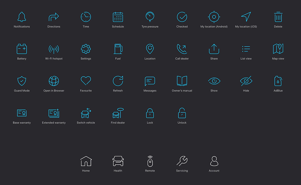
Design system alignment, iconography direction, and developer handoff support
-
Iterative improvements post-launch using analytics, reviews, and user feedback

The Challenge
This wasn’t a simple reskin of FordPass. FordPass Pro needed to serve a different reality: small fleets, where owners, managers, and drivers often share responsibility — and sometimes the same person switches roles depending on the day.
That created a few hard problems:
-
Multiple levels of access and dynamic content depending on role
-
Making key information obvious for fleet managers (alerts, security, health)
-
Keeping driver tasks quick and low-effort (maintenance, security checks, damage reporting)
-
Protecting privacy while still supporting operational oversight
-
Launching alongside the 2019 Ford Transit, with tight timelines and limited research funding
How We Worked
I used a Double Diamond approach to keep the team aligned and decisions grounded in evidence.
Discovery → Define
-
Competitive research across OEM apps and remote-control utilities (e.g., Nest, Tado) to understand expectations for monitoring and control
-
Early user research with small business owners, managers, and drivers to understand priorities (security and productivity consistently rose to the top)
-
Persona development and refinement to keep the team aligned on real behaviours and constraints
Develop
-
Design studios and “How Might We” workshops to generate and stress-test solutions quickly
-
User flows and app maps to ensure the experience scaled cleanly as features grew
-
Rapid prototyping (Sketch / InVision at the time), with guerrilla usability testing when budget was limited — supplemented by formal testing where possible
Deliver
-
Component-based, modular screen design for consistent implementation and easier iteration
-
Clear developer support: screen flows, dependencies, and handoff artefacts so the team could build confidently
-
Ongoing QA using test devices to ensure build quality matched design intent


What We Improved (highlights)
Activation and onboarding (measurable outcome)
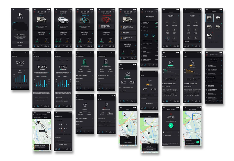
Analytics showed a major drop-off: nearly 90% of users abandoned the original vehicle activation flow early on. I led rapid ideation sessions (Crazy 8s) and prototyping to redesign the flow. By simplifying the steps and reducing confusion, we nearly doubled the percentage of users who successfully activated and reached the home screen.
Security and productivity focus
Research repeatedly pointed to two core needs:
-
“Keep my vehicle safe”
-
“Help me run my business efficiently”
That insight shaped both prioritisation and UI hierarchy — ensuring critical security and health information didn’t get buried under secondary features.
Post-launch iteration and feature work
Over time I continued to design, test, and refine new capabilities — including region-specific needs like Logbook (supporting German tax/legal requirements), Fuel Report, and exploration/testing of security monitoring features inspired by Tesla-style approaches.


App Store Feedback Improvements
To improve feedback quality (and reduce unhelpful negative reviews), I introduced native in-app review prompts at the right moments — after successful flows — with guardrails to avoid spam (max three times per year). We also added a less intrusive in-line feedback option for ongoing input.
After implementation, app ratings improved significantly — including Android rising from 3.3 to 4.4 within a month (before a temporary holiday bug dip that was fixed in January). Overall, the volume and quality of feedback increased, helping the team prioritise improvements with more confidence.

Why This Project Matters
This work shows how I operate on complex, real products:
-
Designing for multiple user roles and real-world constraints
-
Balancing user needs with business goals and technical feasibility
-
Using research + analytics to drive prioritisation
-
Shipping iteratively, improving core funnels, and measuring outcomes
-
Collaborating across agencies, internal teams, and engineering — and keeping it all aligned


