
Ford Pro Mobile: Vehicle Details — IA & UX Redesign for Scale
May 2024 - March 2025
ROLE
UX & UI
TEAM
Ford Motor Company
TOOLS
Figma, Miro
USERS
6,000+
PROBLEM
IA
Project Overview
Fleet management moves fast — and when a vehicle is off the road, jobs get delayed and costs add up. Ford Pro Mobile supports drivers and fleet managers by making it easy to report issues, check vehicle health, assign drivers, locate vehicles, and (increasingly) manage vehicles remotely.
For this project, I redesigned the Vehicle Landing Page — the screen users rely on to quickly understand a vehicle’s status and take action.
Goal: Improve usability and navigation, modernise the experience, and create a layout that could scale as new features shipped.

The Challenge
As the lead designer, I reimagined the vehicle page from the ground up.
User interviews made the problem clear:
-
The page didn’t surface enough useful information
-
Key details were hard to find, especially when users were in a hurry
-
The UI felt visually dated, and the layout wasn’t designed for growth
There was also a product and engineering challenge: the existing design had become a constraint. It made it harder for developers to add new capabilities without the screen becoming cluttered or inconsistent.
So the job wasn’t just “make it look nicer.” It was to:
-
Present a growing set of health and vehicle features without overwhelming users
-
Make the experience quicker to scan and easier to act on
-
Respect the Ford Pro brand (including the iconic blue “swoop”), while still modernising the UI
-
Build a structure that would support upcoming releases like richer health insights, mapping, history, and future remote controls
Results
After global release on iOS and Android, the redesigned experience contributed to:
-
Higher user satisfaction and improved App Store ratings
-
Doubling app downloads
-
Strong growth in active usage across fleets, subscribers, and EV users (see metrics at the bottom).

Team Impact (Figma Enablement)
Alongside delivery work, I also helped raise the bar across the wider design org. In March 2024, I led advanced Figma training for Ford’s design team — covering Variables, Dev Mode, and Auto Layout — reaching 50+ designers across six sessions. I also created “Snippets,” a lightweight internal channel of short videos sharing practical techniques to help designers work faster and more consistently.
Methodology and Process
I used the Double Diamond as a simple, reliable way to move from ambiguity to a shippable solution — without jumping to UI too early. It helped the team stay focused on real user problems, make confident decisions, and iterate quickly with evidence.
-
Discover: Spoke with users and gathered feedback to understand what was confusing, missing, or slowing people down.
-
Define: Turned those insights into clear goals and constraints (including technical limitations and what could realistically ship).
-
Develop: Explored multiple layout and navigation approaches through wireframes and prototypes, validating direction with users and stakeholder reviews.
-
Deliver: Finalised the experience, aligned it with the Ford Pro Design System, and supported engineers through build and release.

Information Architecture and Navigation
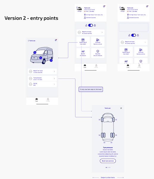
The biggest early win was fixing the information architecture. The existing screen wasn’t structured around what users came for — key health status and next actions — and the oversized vehicle image was taking up valuable space.
Using Miro, I mapped the full vehicle experience (current + upcoming roadmap), so we could design for the next 6–12 months rather than patching the UI each time a new feature launched.
Outcome: an IA that supported a much larger feature set, while keeping the screen calm, scannable, and usable on mobile.
Planned expansions included:
-
A richer vehicle health breakdown
-
Vehicle location and mapping
-
Access to previous inspection/checklist history
-
Space for future remote control capabilities

Competitive Review
To avoid reinventing the wheel (and to make sure we were meeting modern expectations), I reviewed patterns from:
-
Consumer OEM apps (e.g., BMW, Tesla, VW)
-
Fleet and telematics tools (e.g., Fleetio, Geotab)
This helped validate decisions around:
-
How to prioritise information on a dense screen
-
Common UI patterns for status, diagnostics, and “next best action”
-
What “good” looks like for power users who need speed and clarity

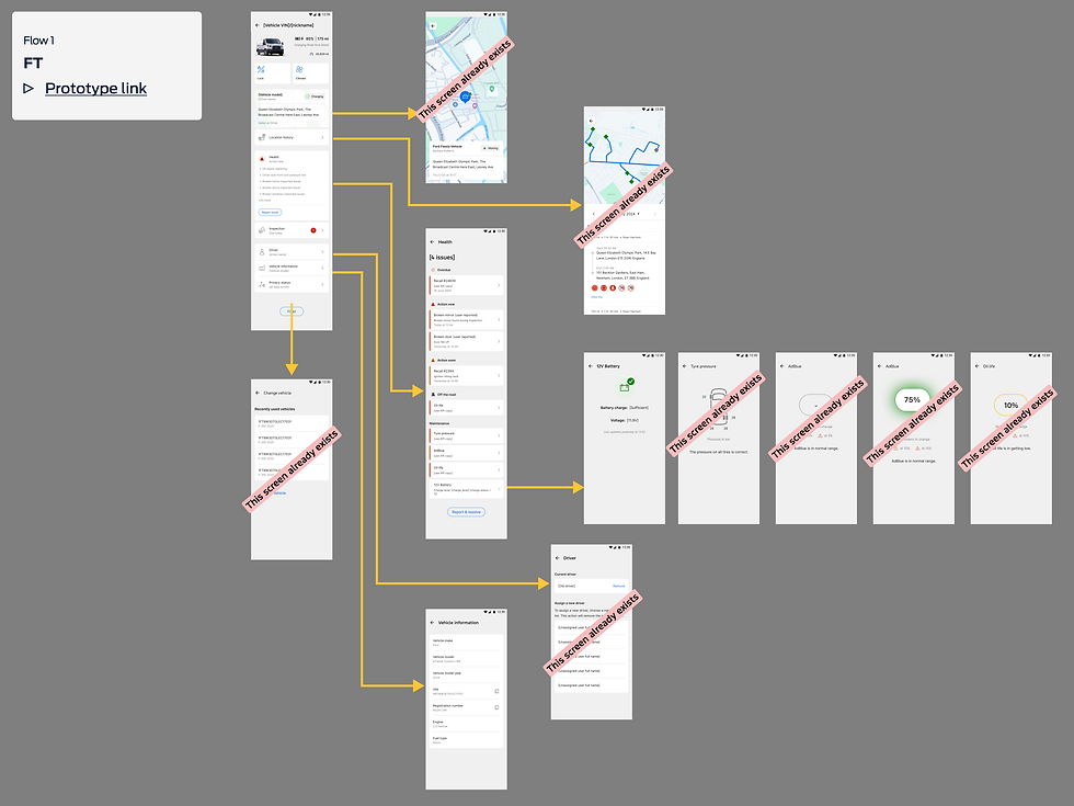
Wireframes and Stakeholder Alignment
With research and IA in place, I created early wireframes in Miro and used them to align senior stakeholders quickly. Rather than presenting a single “perfect” option, I brought multiple layout directions to compare trade-offs.
A key insight from user sessions: vehicle health features were the primary reason people visited this screen, especially users who switched between being a fleet manager and also driving vehicles themselves. The design needed to reduce friction between these roles, not assume one “type” of user.


High-Fidelity Design and Iteration
Once we agreed a direction, I moved into Figma and built high-fidelity prototypes using the Ford Pro Design System, creating custom components only where needed.
Over several months, I iterated the design 17 times, using:
-
User feedback and usability sessions
-
Input from engineering on feasibility and performance
-
Ongoing stakeholder review to keep scope and priorities aligned
Some ideas were deliberately parked due to technical constraints — but the final design still delivered a meaningful upgrade and left room for future expansion (especially remote control functionality).
To strengthen delivery, I also ran quarterly retros with the development team to improve how we worked together — what was going well, what was slowing us down, and what we needed to change to keep momentum high.


Results
Since global release on iOS and Android:
-
App downloads doubled
-
App Store ratings improved significantly
-
Weekly active fleets increased 11×
-
Weekly paid Telematics subscribers using the app rose from 9% → 19%
-
Weekly active EV users increased by over 2× (supported by expanded vehicle-page features)
-
Monthly active users increased 331%
What users said (themes):
-
The expanded health information made it easier to understand the state of a vehicle quickly
-
The screen better supported people who frequently switch between vehicles
-
The experience felt clearer and more “work-ready” for fleet use


What I Learned
This project reinforced a few things I now bake into every redesign:
-
IA first: if the structure is wrong, UI polish won’t save it
-
Iterate with reality: design decisions got better as soon as engineering constraints were part of the conversation early
-
Collaboration is a feature: regular retros and tight feedback loops improved both speed and quality
Next Steps
Next iterations will focus on:
-
Expanding remote control functionality
-
Continuing to refine the experience based on live feedback and usage patterns
Two junior designers will support the dev team going forward, and I’ll remain available for guidance on direction, design quality, and system alignment when needed.
“As a busy driver of a company fleet vehicle, having a well-maintained vehicle is critical to ensuring you can complete your jobs on time. Ford Pro Mobile is designed to help you do just that. By providing you with a quick and simple way to inform your manager of any issues, your vehicle can be maintained to the highest standards.”
— FORD MOTOR COMPANY, GLOBAL