Music Streaming Concept (Memorisely) -
Visual Design Sprint
March 2023
ROLE
UX & UI
TEAM
Sole Designer
TOOLS
Figma
In April 2023, I completed a 10-week, part-time Visual Design course with Memorisely to sharpen my visual craft and get even more confident with advanced Figma workflows.
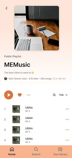
For the final project, I designed a desktop and mobile music streaming experience — a concept product positioned alongside platforms like Spotify, Apple Music, YouTube Music, and Amazon Music. The goal wasn’t to reinvent music streaming, but to practice building a polished, scalable UI with strong fundamentals: hierarchy, spacing, accessibility, and interaction details.
You can explore the final prototype here: [link]

What I Practiced and Improved
-
Visual hierarchy, spacing, layout rhythm
-
Typography, colour theory, and responsive grids
-
Component-based UI thinking (atoms → components → patterns)
-
Advanced Figma workflows: Auto Layout, Variants, Component Sets, Grids, and Prototyping transitions
-
Designing consistent, reusable UI that works across desktop + mobile
The Process
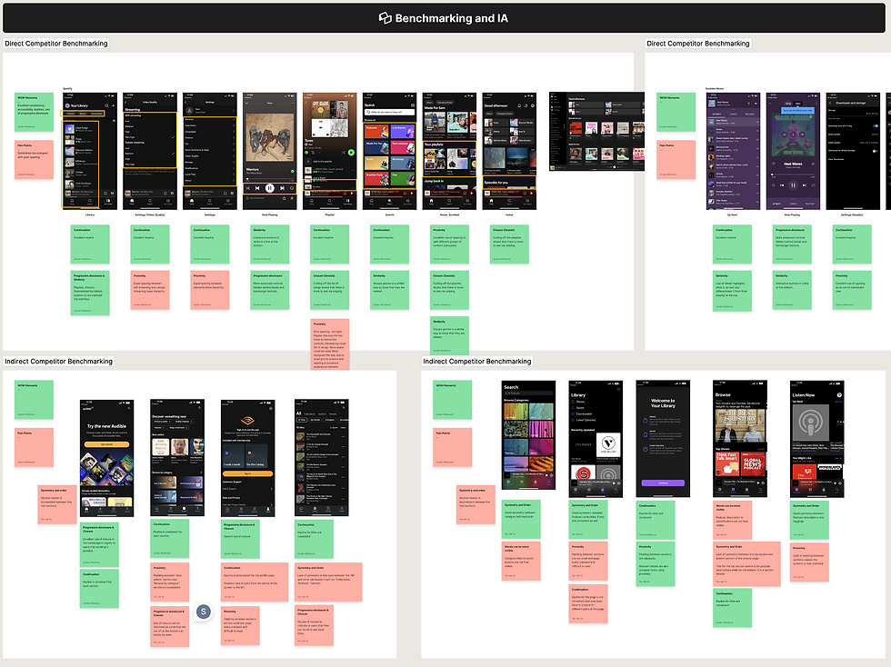
1) Competitor review
I started with a competitor teardown of major music platforms (Spotify, Apple Music, YouTube Music, and others), focusing on:
-
Information architecture and navigation patterns
-
UI consistency and spacing systems
-
Accessibility (contrast, states, readability)
-
Discoverability — where apps hide features or expect too much from new users
This helped me identify opportunities to improve clarity and reduce friction without changing the core behaviour users already understand.
2) Core user flows
Next, I mapped the key flows most users follow:
-
Browse / discover music
-
Select an album/playlist
-
Play, pause, switch tracks, and navigate between sections
That flow work shaped the IA and ensured the layout supported real usage, not just pretty screens.

3) Styles and system setup
From there I moved into early wireframes, then built a simple style direction using:
-
A clear typographic scale
-
A considered colour palette with accessibility in mind
-
Grid rules for responsive layout consistency
I’ve built design systems before, but this course helped me do it faster and cleaner by fully leaning into Figma’s newer capabilities.


4) High-fidelity prototype (Figma)
The final weeks were all about execution and interaction polish. I built the UI with a component-first approach:
-
Auto Layout everywhere (no manual grouping or brittle frame hacks)
-
Variants + component sets for scalable behaviours and responsive sizing
-
Interactive prototype states: playlist selection, play/pause, hover highlights
-
Skeleton loading states to simulate real product loading behaviour
-
Thoughtful spacing, contrast, and usability improvements across key screens
The end result inevitably nods to Spotify — that’s the reality of familiar patterns in this space — but I focused on bringing a distinct visual twist while improving consistency, accessibility, and overall clarity.