FordPass Pro 1.5 — Scaling the UX for Small Fleets
February 2020
ROLE
UX & UI
TEAM
Ford Motor Company
TOOLS
Adobe Illustrator, Adobe Photoshop, Sketch, Figma, Invision, Keynote, Zeplin, Abstract, Usertesting.com
FordPass Pro is Ford’s global app for commercial customers, designed to help small business owners (typically 1–5 vehicles) monitor and manage their vans remotely — security, vehicle health, productivity, and day-to-day control.
After the initial launch, the app grew quickly as new features and capabilities were added. That growth was great for the product — but it also introduced usability issues. I helped lead a design revision to make the experience clearer, more scalable, and more focused on the tasks users actually come to the app for.
If you want the full context, this work builds on my earlier FordPass Pro case study and continues the evolution of the app’s UX and UI.

My Role
I worked as the lead UX designer on the redesign, partnering closely with a senior UI designer, product leadership, and engineering. My contribution included:
-
Reviewing analytics to understand the most-used features and where users dropped off
-
Research planning and remote testing throughout COVID
-
Concept exploration and IA/navigation redesign
-
Prototyping in Figma (and early sketches in Balsamiq/iPad)
-
Synthesising findings into clear recommendations for stakeholders
-
Designing an incremental rollout approach that engineering could actually ship
The Problem
As FordPass Pro expanded, parts of the experience became harder to use — especially for customers managing multiple vehicles.
The biggest pain points were:
-
The home experience struggled to scale from “one van” to “a small fleet”
-
Key security and productivity features weren’t prominent enough
-
New features were starting to overwhelm the simple, task-first journey we’d originally designed
-
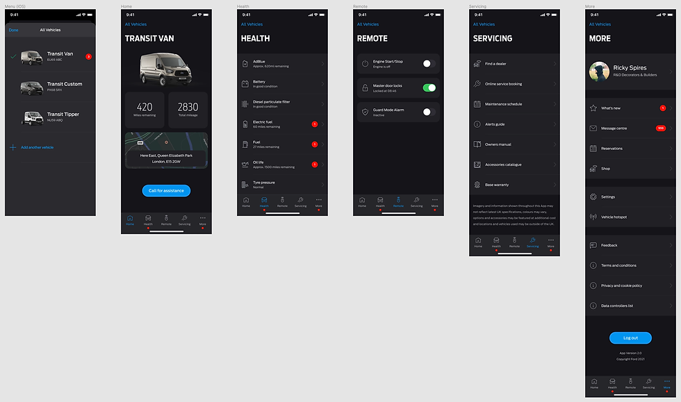
Certain terminology didn’t translate well globally (for example, “Garage” confused users — particularly in markets where it doesn’t map to a depot/work fleet mental model)
App Store reviews and user research backed this up: people wanted the app to feel simpler, faster, and more obvious — not more complex.
Constraints
This work took place during the COVID pandemic, so all discovery and testing was remote. To keep momentum, I set up recurring monthly usability and concept tests via usertesting.com, so we could iterate continuously instead of relying on one-off research bursts.
While five participants can uncover a large share of usability issues, I deliberately tested with 15 van drivers per concept to get stronger signal on preferences, comprehension, and edge cases — across ages, backgrounds, and genders.
Because FordPass Pro is global, we also needed to account for cultural nuance and expectations across regions, while staying consistent with the emerging Ford design system guidance in North America.
The Approach
I used the Double Diamond framework to keep the work focused and practical — especially with limited designer capacity.
1) Evidence-led discovery
I combined:
-
analytics (what users actually do)
-
app reviews (where frustration shows up)
-
existing FordPass Pro research
-
fresh remote testing
This gave us a clear picture of what was broken, what mattered most, and what we could improve first.

2) Updated personas
Building on the research I’d previously run (around 50 user interviews), I refreshed key personas to reflect how the product and audience had evolved — especially around multi-vehicle needs and task priorities.

3) Rapid prototyping in Figma
For concept exploration we moved away from Sketch and leaned into Figma for collaboration and version control. Early ideas were sketched quickly (hand/iPad/Balsamiq), then refined into clickable prototypes for testing and stakeholder review.
I ran weekly demos with PMs and developers so we could stress-test feasibility early and keep the MVP realistic.

Key Design Decisions
Navigation A/B testing
To improve scalability, I tested two navigation models:
-
Bottom navigation (fast and visible, but limited to ~5 items)
-
Side menu (more scalable, but easier to ignore and harder for orientation)
Both scored well (average usability 9/10, NPS 70), but the side menu caused more “where am I?” confusion. The bottom nav created stronger orientation and quicker access to the most-used areas — so we chose bottom navigation going forward.


Fixing “Garage” and multi-vehicle management
Testing confirmed that “Garage” wasn’t clear globally, and the experience didn’t support multi-vehicle management well. We shifted toward a more direct, dedicated vehicle management view.
We also tested a VIN add flow that used the phone camera to scan the VIN — which users responded to strongly, and it was confirmed for future development with further stress testing planned.

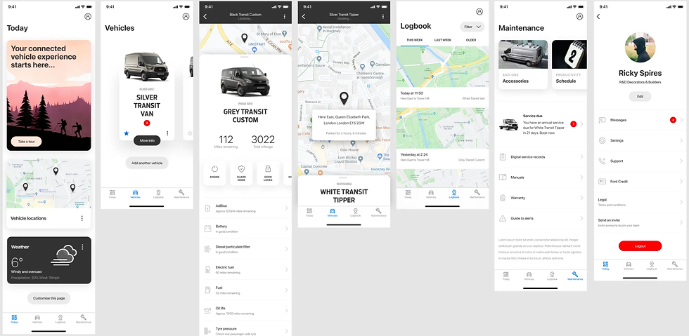
Home experience + dashboard rethink
I explored a map-led dashboard concept to help users see multiple vehicles quickly. It tested well overall, but some users were confused on first entry — so we moved the dashboard concept into the vehicle experience instead, reducing cognitive load on the home screen.
We also introduced the idea of a first-login “Take a tour” module to reduce confusion and guide new users through key actions.

Scroll and modular layouts
A fixed-ratio home layout was limiting on smaller screens. I proposed moving to scrollable content with clear cues (e.g., cut-off cards) to signal there’s more below the fold.
This also unlocked a more modular home layout, giving users optional customisation — and giving the business a clearer view of what features mattered through interaction data.

Synthesis and Stakeholder Alignment
In the Define phase, I created short video clips and structured notes from testing sessions and presented them back to stakeholders. This helped keep decision-making grounded in user evidence, not opinions — and made trade-offs easier to agree on quickly.


Outcome: A Shippable Path (“FPP 1.5”)
The concepts were well received, but PMs and the product owner were concerned about the development timeline for a full IA rebuild.
So I proposed an incremental approach: “FordPass Pro 1.5.”
Instead of a big-bang redesign, we shipped improvements in a way engineering could deliver safely:
-
Update colours, iconography, and component quality
-
Introduce key usability fixes (scrolling, clearer vehicle management patterns)
-
Keep the existing architecture initially, then evolve IA later
This allowed the team to improve the experience screen by screen, reduce risk, and maintain consistency — while still moving the app toward the longer-term vision.